My Role
Content design, IA, naming, flow logic, and content hierarchy.
Team
Data Science for problem framing, PM, Product Designer, and one Engineer.
Methods
Funnel analysis, competitive benchmarking, IA mapping, and A/B testing.
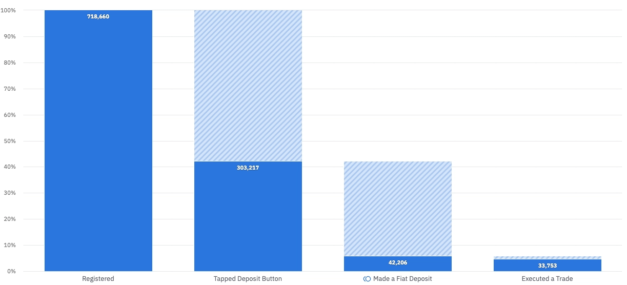
77% of users never made a deposit, and without one, the product is empty
Bitso is a crypto exchange focused on Latin America. Deposit is the only way to bring money into the platform. Without a balance, users can't buy, convert, or trade. It's the single most critical action in the entire product.
Data Science flagged a severe drop-off in the deposit funnel. Of 718,660 registered users, only 42,206 completed a deposit: a conversion rate of around 23%. The biggest drop happened at the very first step: users were tapping the deposit button and abandoning immediately.
I owned the content and IA decisions, and identified the root cause
I Led
- Root cause diagnosis: the language mismatch
- All three IA grouping explorations
- Naming and labelling decisions throughout
- Content hierarchy in the final flow
- Rationale for choosing option 3
Team Owned
- Funnel data and problem framing
- UI design and component decisions
- A/B test setup and analysis
- Technical feasibility of ramp options
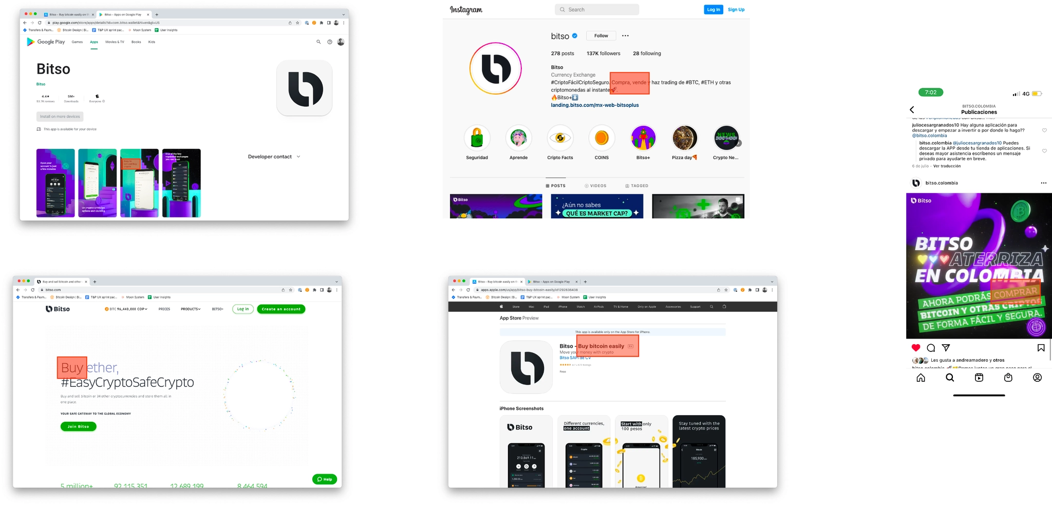
Marketing said "buy crypto." The product said "deposit". Users got lost in between
I started by asking a question the funnel data couldn't answer: what mindset do users arrive with? Looking at Bitso's marketing (ads, app store listings, social media) the message was consistently "buy crypto." But inside the product, there was no "buy" button. There was only "deposit."
Users who wanted to buy were hitting a deposit flow and not recognizing it as the path forward. They weren't dropping off because the flow was broken, they were dropping off because the language told them they were in the wrong place.
The secondary problem I found
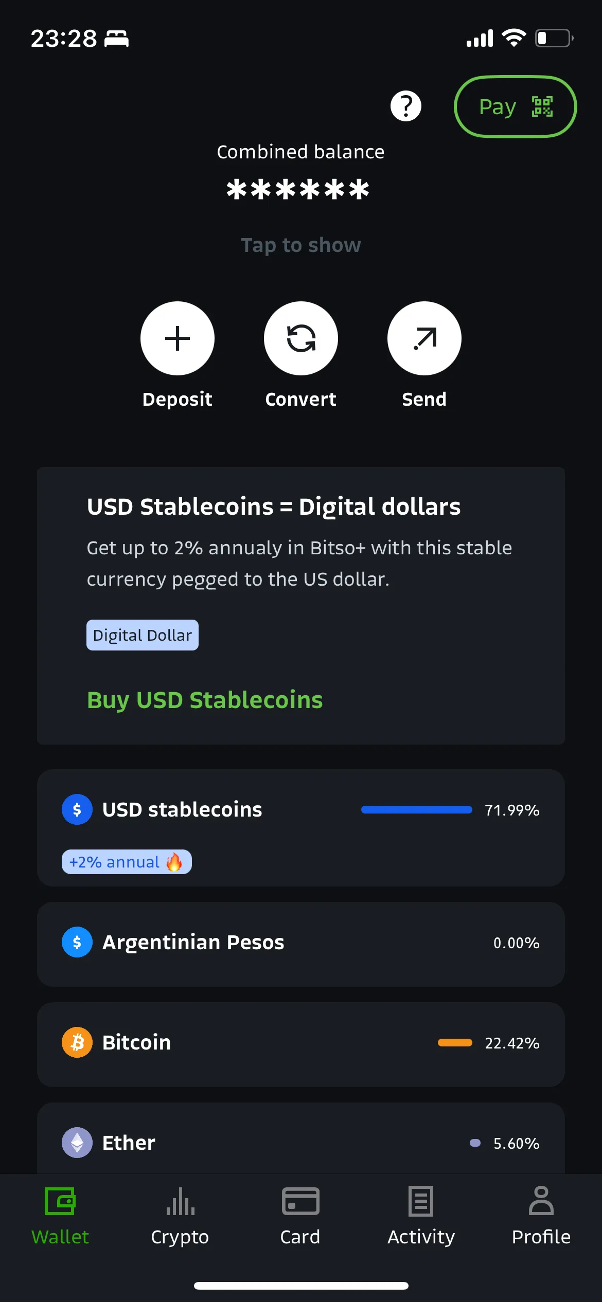
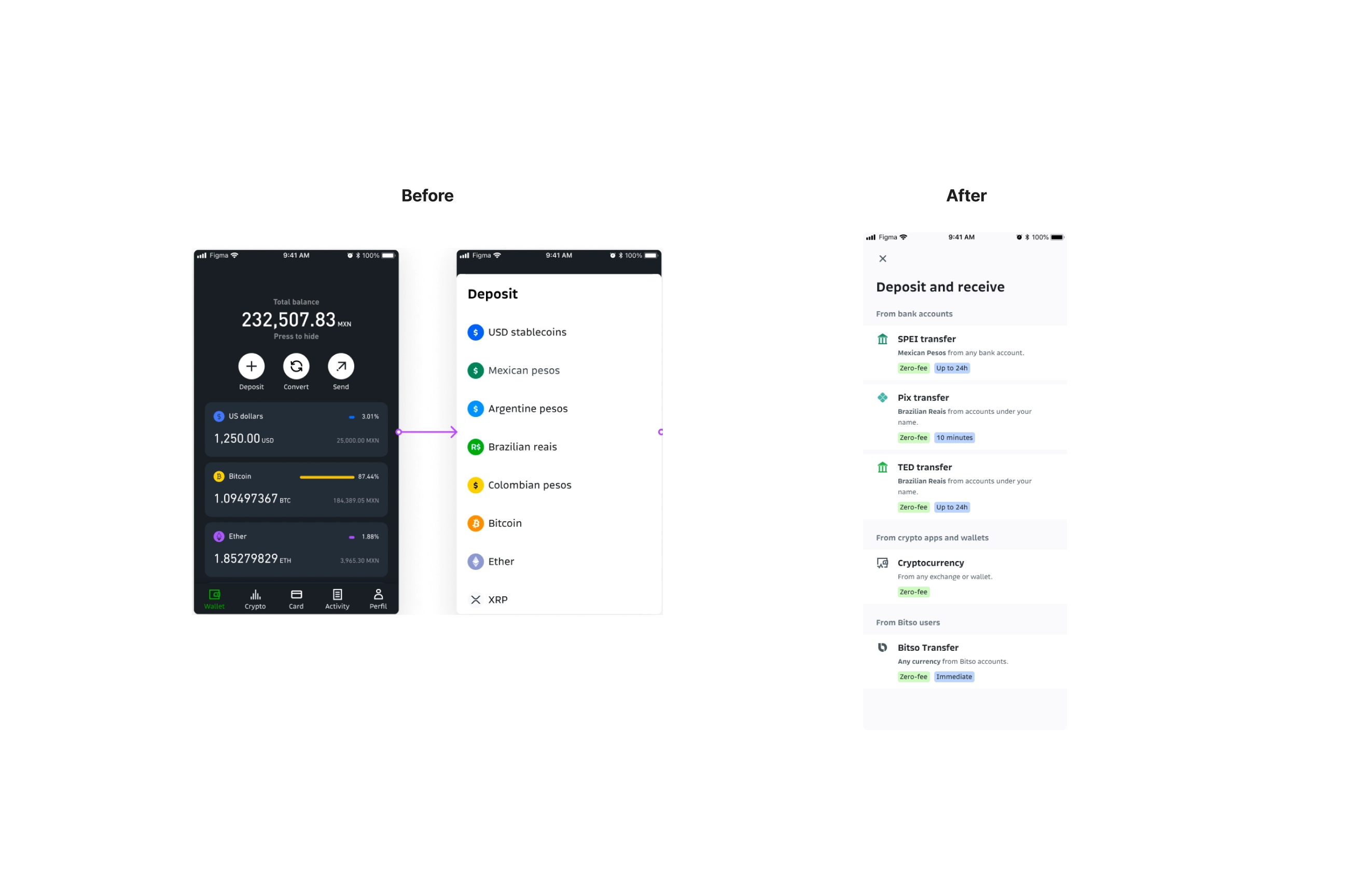
Even users who understood "deposit" were immediately confronted with a list of 42 currencies, an overwhelming choice architecture that forced them to know what they wanted before the product had explained their options. The first step asked for expert-level knowledge from brand new users.
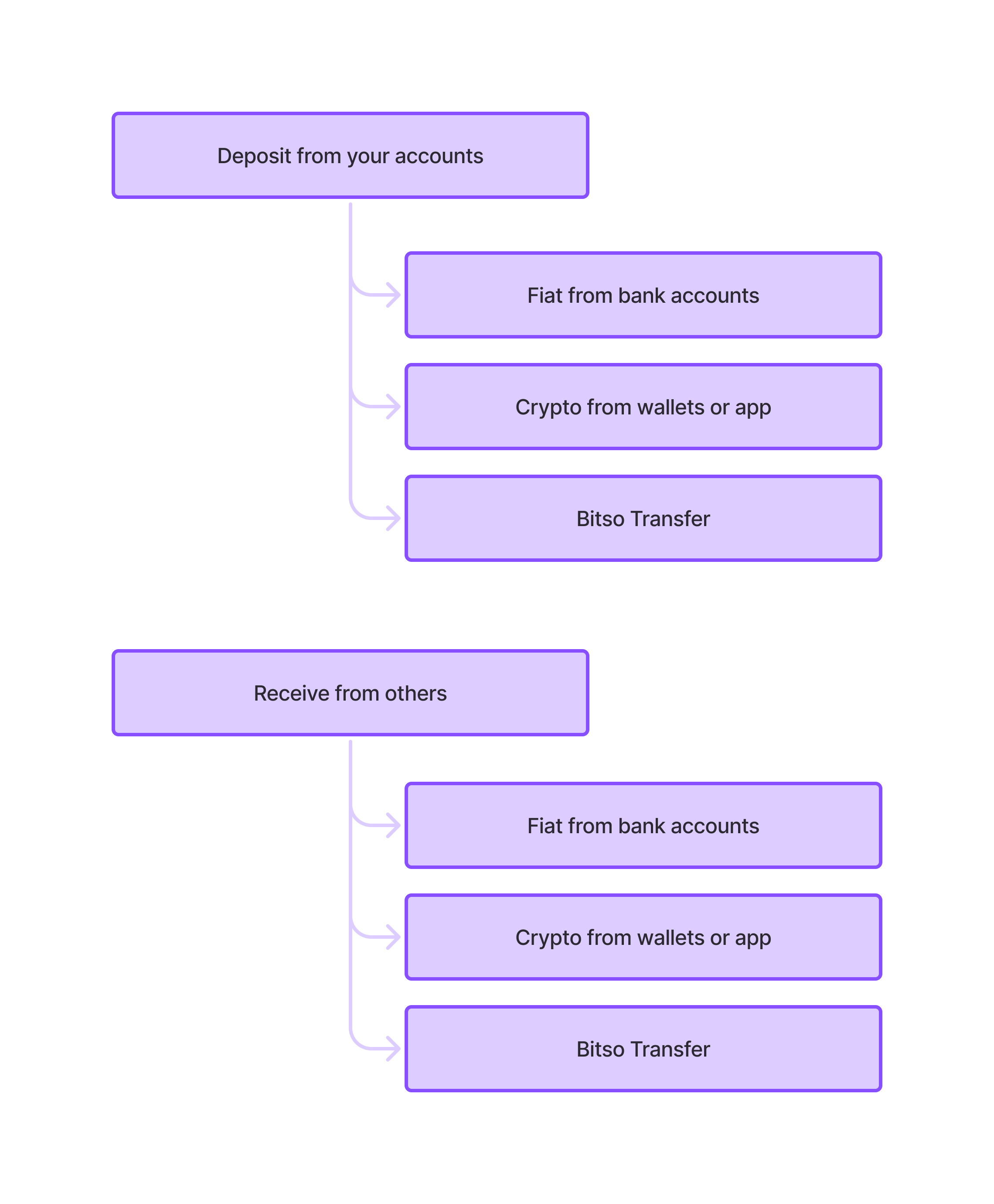
Three ways to group 42 options. Only one scaled
The core content design challenge was: how do you reduce 42 options to something a new user can navigate in seconds? I explored three grouping models, each with different logic.
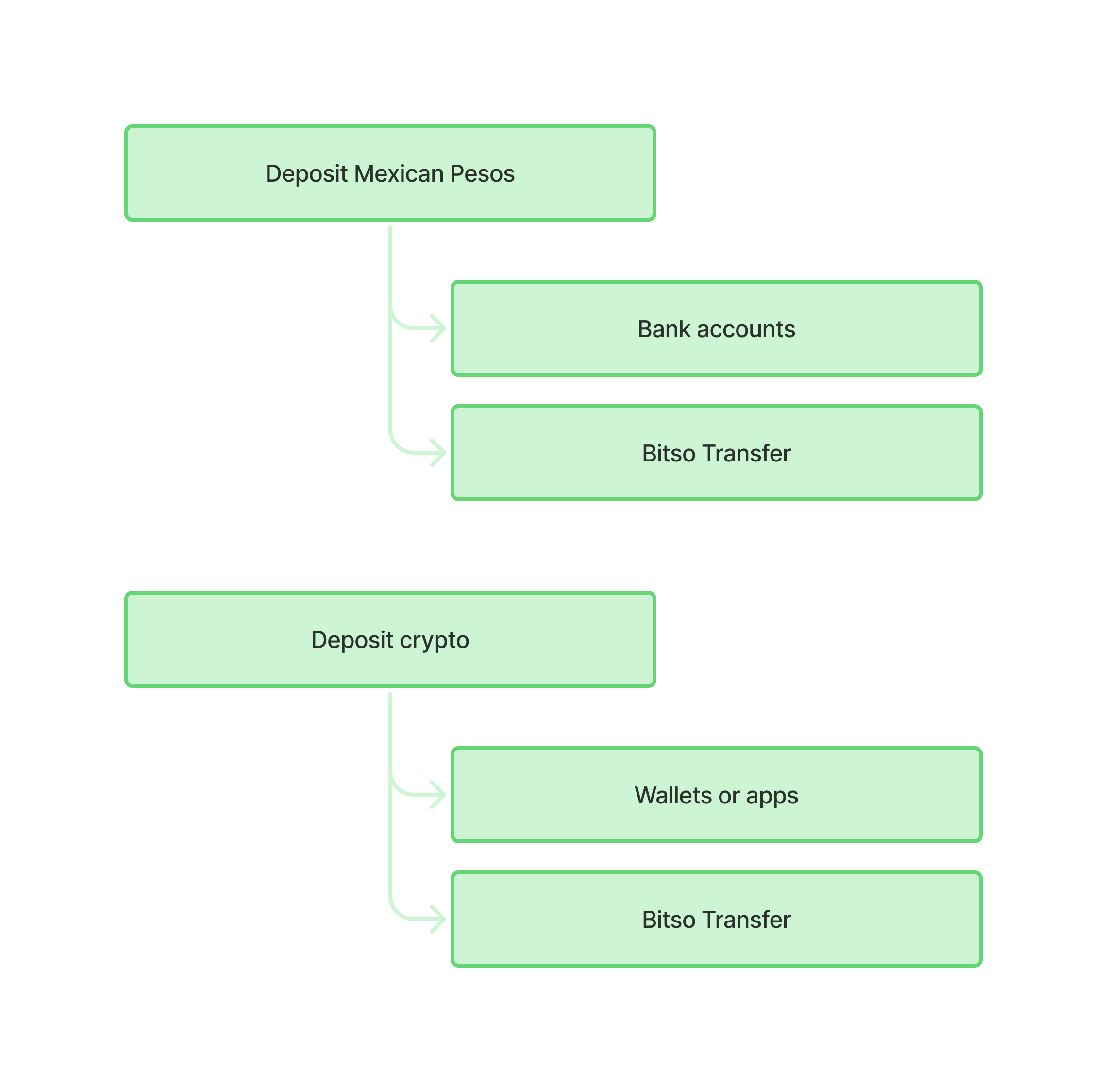
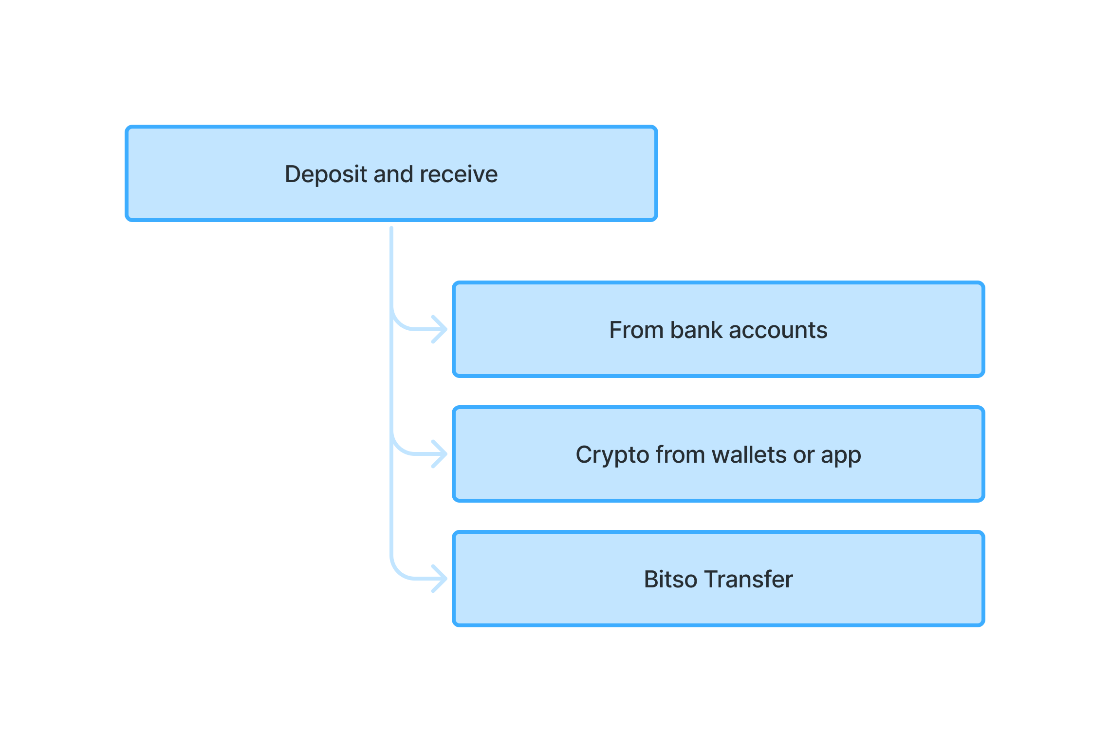
Option 3: It scales, avoids duplication, and removes a currency selection step
Why not option 1?
Fiat vs crypto requires users to identify their asset type first. New users often don't think in those terms. Someone who wants to "add money from their bank" shouldn't need to know whether that's "fiat" to find the right path.
Why not option 2?
Ownership grouping duplicates Bitso Transfer and adds cognitive load. Users who encounter the same option twice assume they've made a wrong turn.
Why option 3?
Method-first grouping maps to how users already think about money movement. Everyone knows the difference between a bank, a crypto wallet, and another user. This model requires zero financial literacy to navigate and scales cleanly as new fiat ramps are added.
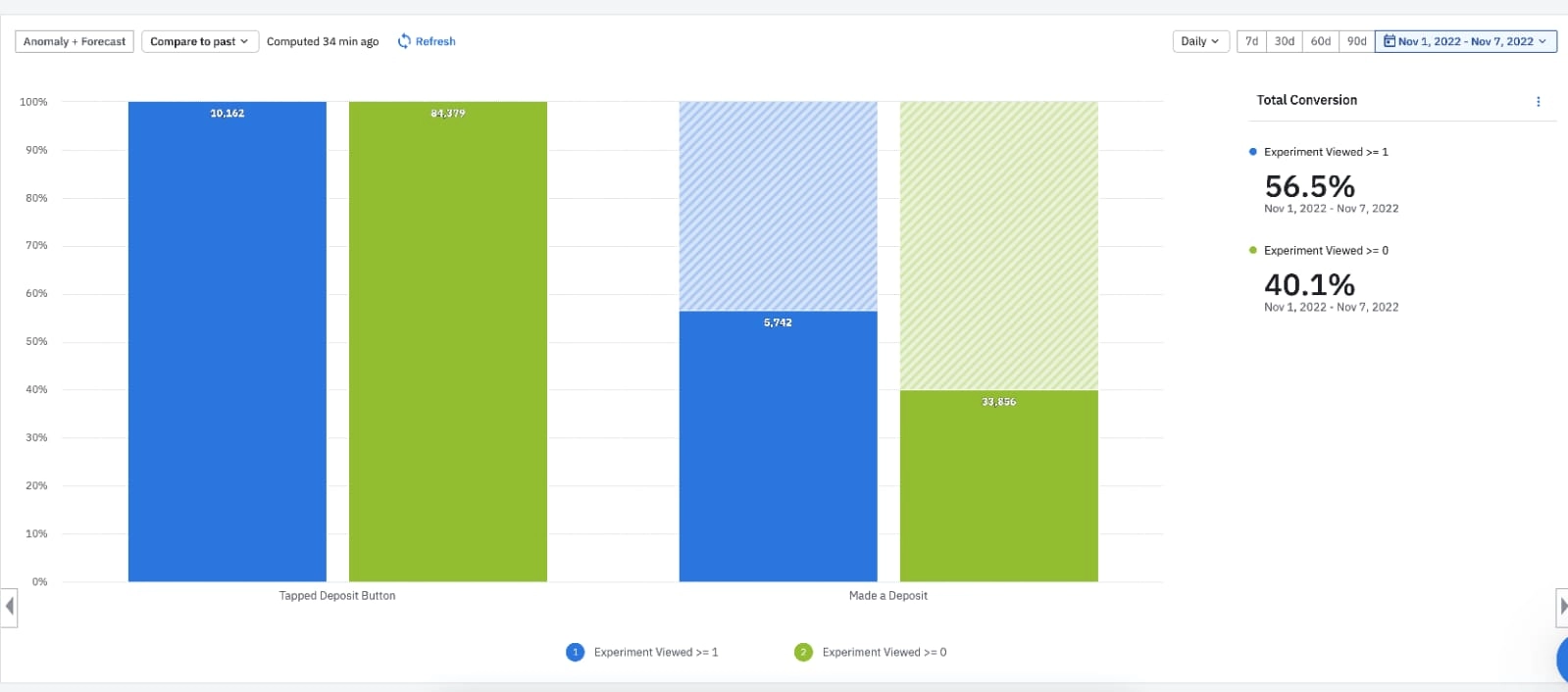
+15pp deposit conversion in one week
The A/B test ran against the original flow. Users who saw the new grouped architecture converted at 56.5% from deposit tap to completed deposit — compared to 40.1% for the control. That's a 15-percentage-point lift, in one week, with no engineering changes to the underlying deposit mechanics.
What I'd do differently, and what's next
What I'd do differently
Run a quick usability test on the three grouping options before going straight to A/B. We had strong rationale for option 3, but a 30-minute session with 5 users would have validated the naming before shipping, and might have caught the "deposit and receive" label ambiguity earlier.
What the next experiment would be
Address the upstream problem: the "buy crypto" language mismatch. The architecture fix improved the flow, but users who arrive expecting to "buy" still encounter a "deposit" entry point. A buy-first flow, even as a thin layer over the same backend, is the remaining gap.