My Role
Content design partner. Strategy, copy, research facilitation, experiment design.
Team
PM, Product Designer, Developers, Education team (Phase 3).
Methods
User interviews, A/B testing, competitive benchmarking, persona mapping.
Voluntary churn had grown significantly, and we had no targeted content response
Hotjar is a subscription-based analytics tool. Over two years, cancellations had grown 23% compared to 2022, voluntary cancellations representing 75% of all churn. The product had a generic deflection modal that reduced churn by 5% (contributing $800–900K in ARR), but it treated every cancelling user the same, regardless of why they were leaving.
The hypothesis: if we could personalize the content response to the user's specific churn reason, we could meaningfully reduce voluntary churn. This became a year-long initiative across three phases.
The content problem underneath the business problem
Users cancelling for budget reasons need a different message than users who rarely used the product. A single modal saying "are you sure?" treats all intent as equivalent, and wastes the moment of highest engagement a cancelling user will ever have.
I owned the content strategy, and partnered up on the research that shaped it
I Led
- Content strategy across all three phases
- User interview facilitation and synthesis
- Per-segment content propositions for Phase 3
- Persona mapping from churn survey data
- Content hierarchy decisions on every version
- Competitive benchmarking (Dropbox, Headspace)
- Educational resource selection
Team Owned
- A/B test setup and analysis (PM + Engineering)
- UX and UI design and component decisions (PD)
- Technical feasibility and dev timeline (Eng)
Churn deflection modal: optimizing the moment of cancellation
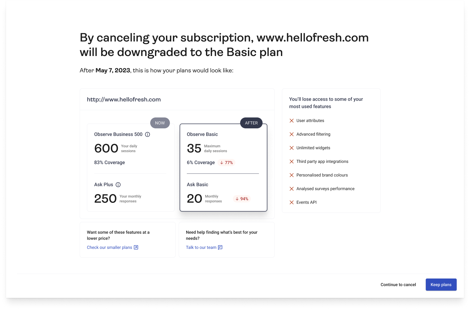
The existing modal was generic. My hypothesis: personalizing the content around what the user would concretely lose (not just a list of features) could shift their decision. We run 2 sets of user interviews where we elaborated 2 versions, and then a A/B test running at the same time.
Main Hypothesis
Content decision #1 Lead with loss of their actual usage data, not just a feature list
Users already know what the plan includes. What they don't know is exactly how much they'll lose. Showing their specific session and response counts makes the downgrade concrete and personal.
Content decision #2 Introduce a before/after structure with an exact date
Vague language like "you'll lose access" creates anxiety without giving users a decision framework. Showing "your plan changes on [date]" gives them control and reduces the fear of immediate loss.
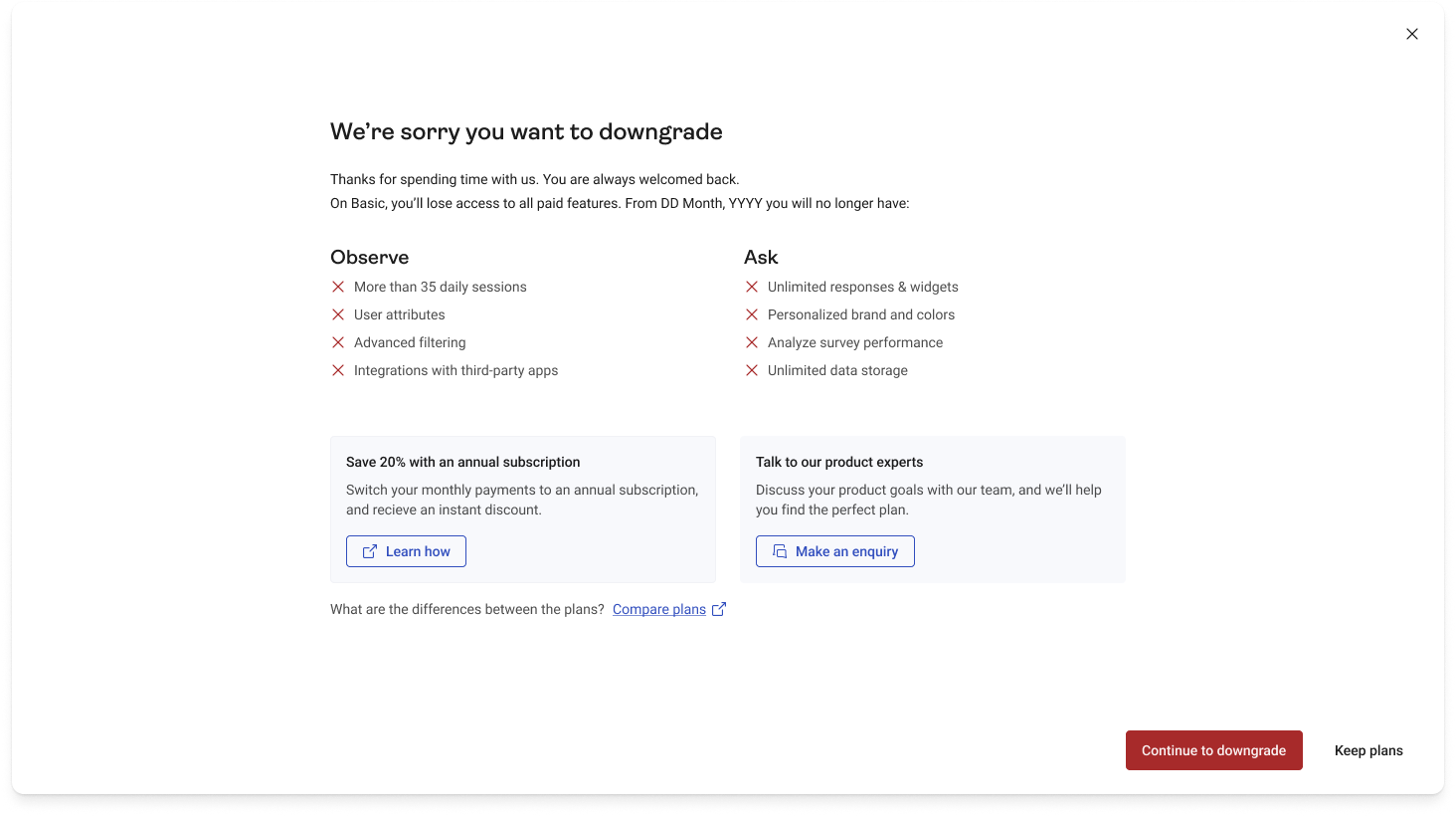
V1: Usage data + before/after + feature list by plan. Focused on sessions and responses they'd lose, with plan-specific feature comparison and an exact cancellation date.
Research findings:
👎 Users didn't express concerns about losing coverage, since it was expected.
👍 Users understood the structure but focused more on feature loss than usage data.
👍 Before and after with the exact date was positive.
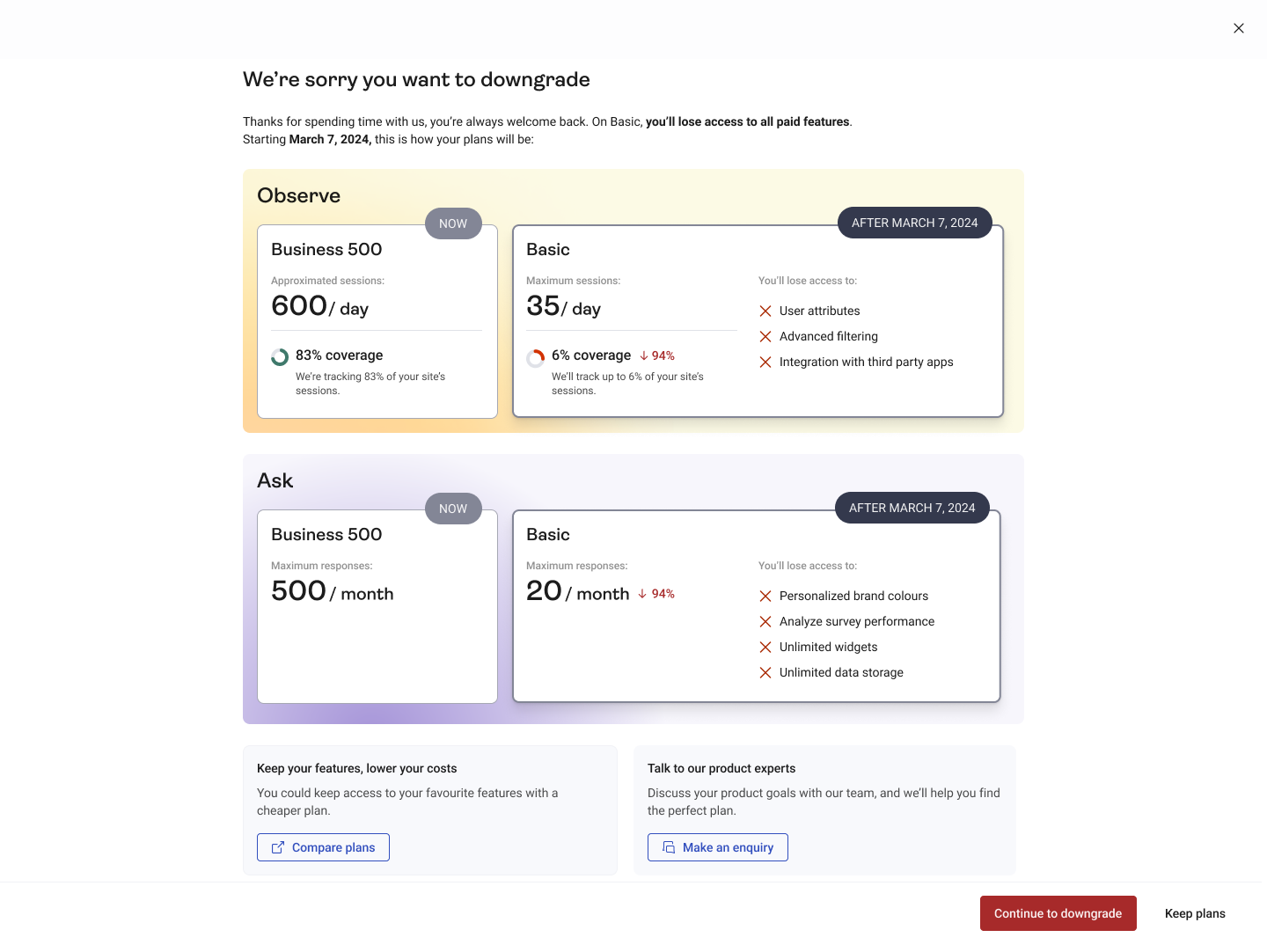
V2: Feature-first hierarchy, clarified cancellation language. Bigger focus on the features they use most (from interview data), and specify what it meant "to continue" and what cancellation means.
Research findings:
👎 "Downgrade" vs "cancel" language created confusion in the same flow.
👎 Some users thought the metrics were generic, not personalized.
👍 Users understood the purpose of the modal, when changes will be applied, and what they'll lose.
A/B test: v1 and v2 performed identically (85.74% vs 84.82%)
A null A/B test isn't a failure, it's signal. If optimizing the existing modal structure couldn't move the needle, the issue wasn't copy quality. It was that we were asking users to reconsider without giving them a genuinely compelling alternative. That insight directly informed Phase 2.
Salvage offers: personalized by the reason they're leaving
As seen before, the churn deflection modal works and brings awareness to what will happen, however, that isn't a incentive by itself. What is? An offer.
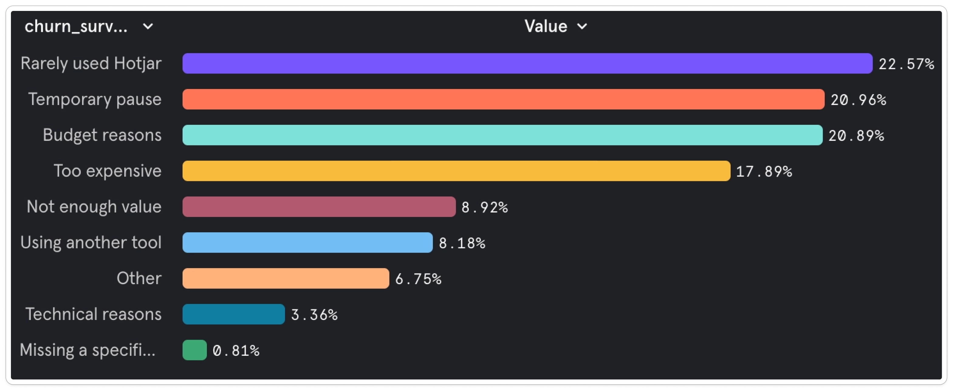
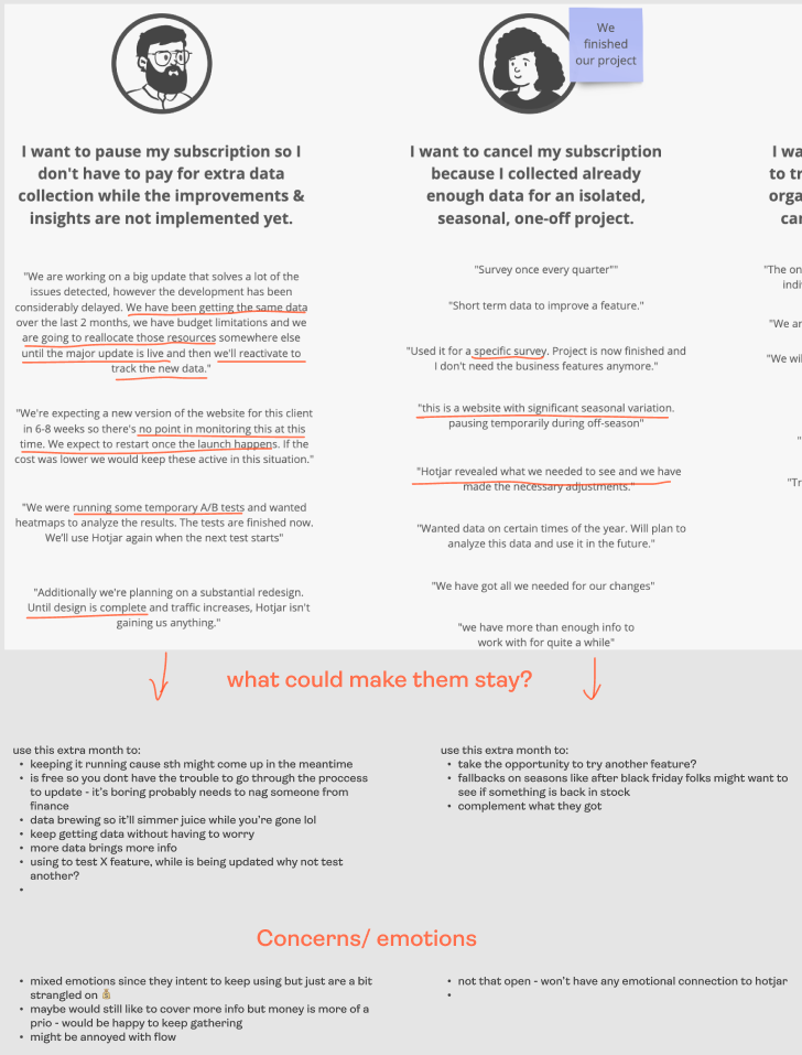
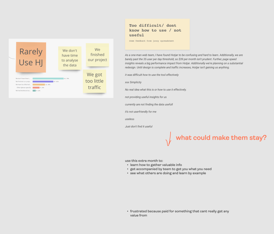
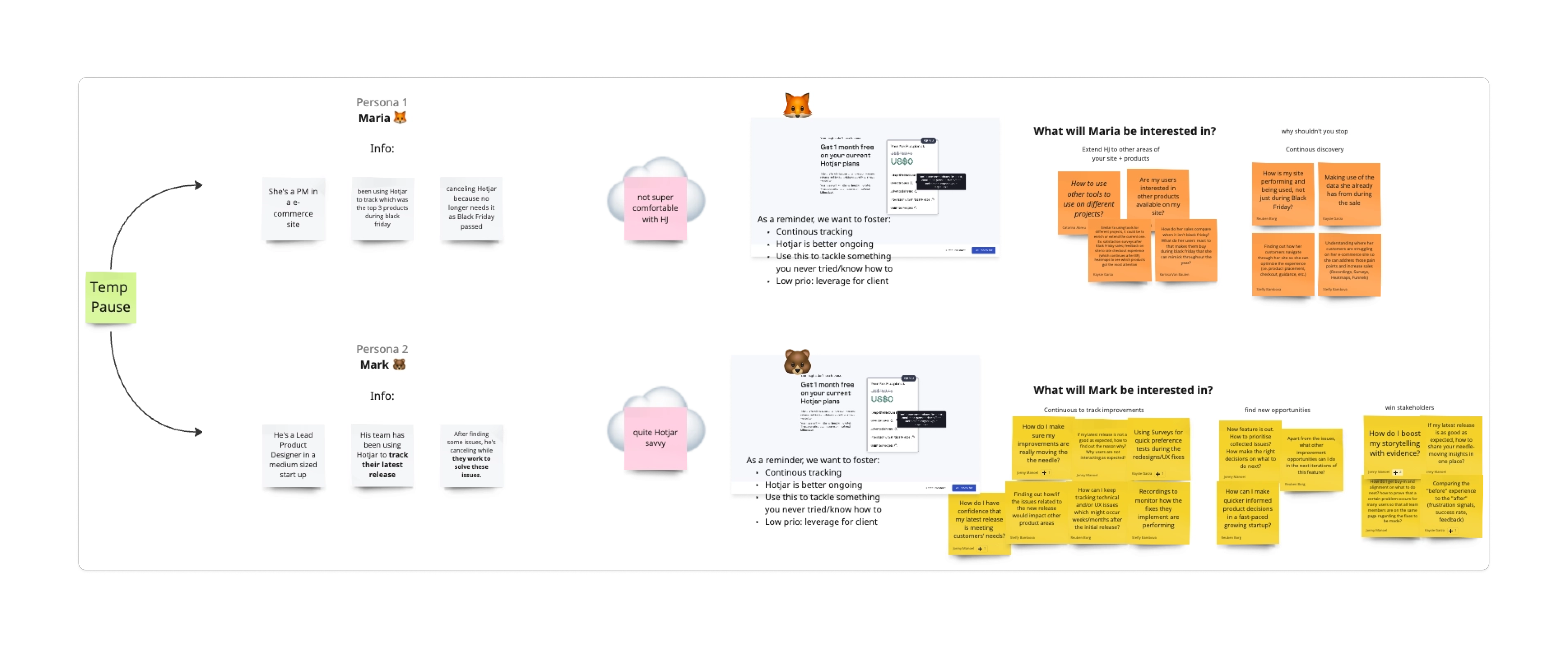
So my team and I analyzed churn survey data to identify the biggest cohorts and decided to offer 1 month free to these users. "Budget reasons" and "Too expensive" together represented ~38% of churning users, the largest addressable group. Other than these 2, we also decided to focus on "Rarely used" and "Temporary pause", the main 2 reasons. By targeting these first, we could cover 80% of all churn across three cohorts with tailored content, which could mean $1.4M in ARR if we deflect 5% of the churn.
Content proposition per cohort
- Budget reasons → "make your money worth it"
- Temporary pause → "get more with what you already have"
- Rarely used → "don't let time be your enemy"
How did I come up with the content proposition?
Reviewed several churn surveys, grouped by their reason, and went through all their written feedback. With this, I was able to create several personas, their main concerns, and what could potentially make them stay.
Content Decisions
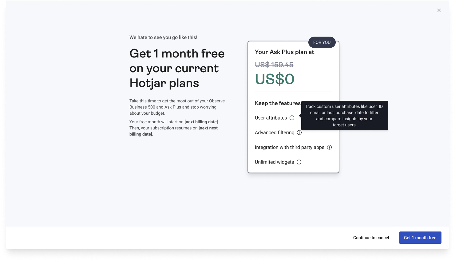
Lead with the benefit headline, not the offer mechanics
"Get 1 month free on your current Hotjar plans" — the benefit is front and centre before any conditions or explanations. Users in the moment of cancellation are emotionally activated; they need to see value immediately or they tune out.
Connect with their main concerns
The content would be specific to each segment's main concern. Whether it’s no time to analyze their data, or simply the project has stopped, the content needs to cater to their needs.
Visibility on payment date
Payment is what the user is most concerned about, so this needs to be present and highlighted. If they’re accepting an offer, we need to be clear of what will happen.
Communication strategy: keeping users engaged during the free period
Getting users to accept an offer is only half the problem. If they don't find value during the free period, they churn anyway at the end of it. Phase 3 was about building a content strategy to make the free month(s) actually count.
I organized a cross-team brainstorm, mapped churn reasons to personas, and worked with Marketing and Education to identify which resources drove the most signups and account creation. Then I matched the top-performing content to each cohort — not generically, but with headlines rewritten to speak to that cohort's specific motivation.
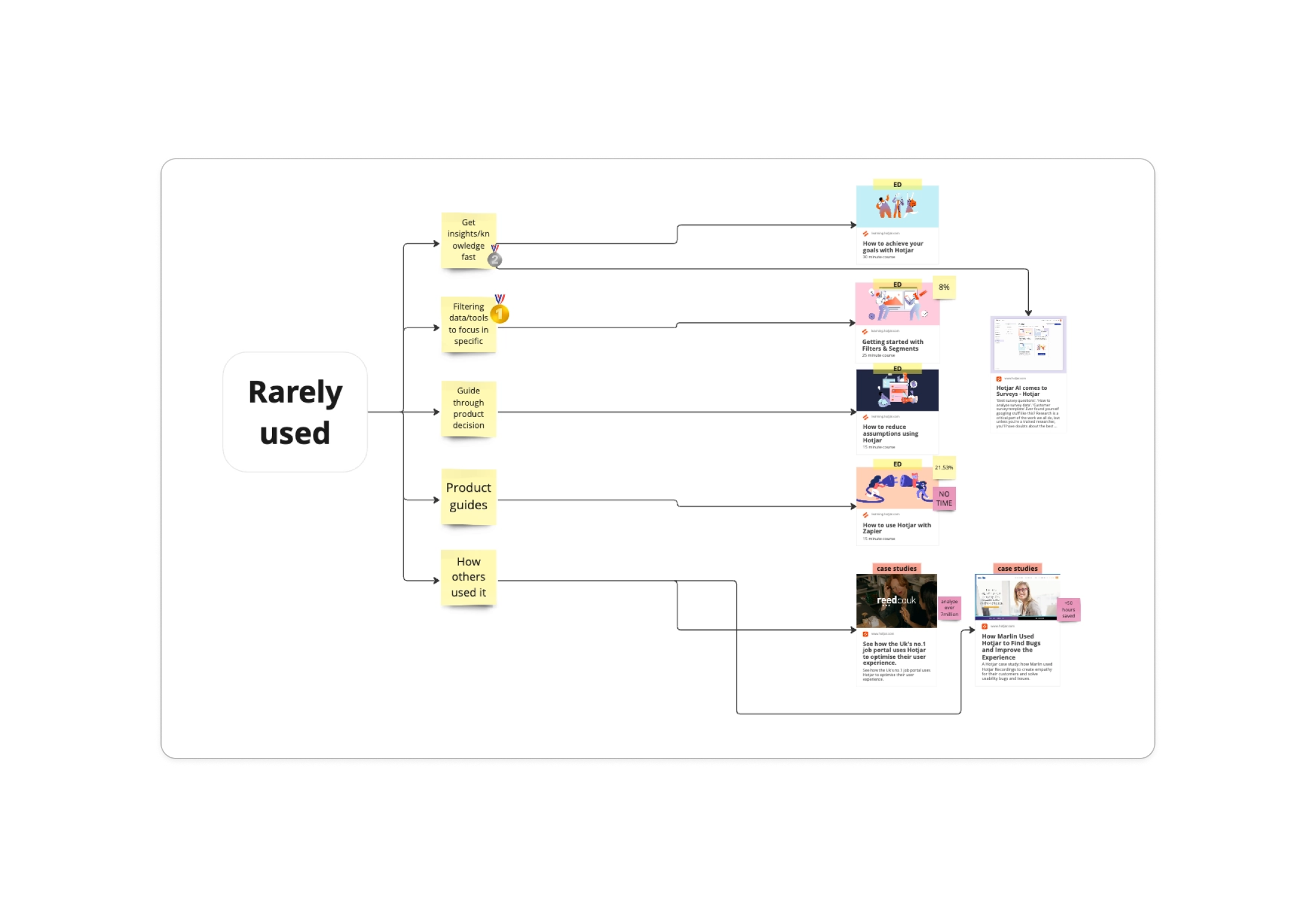
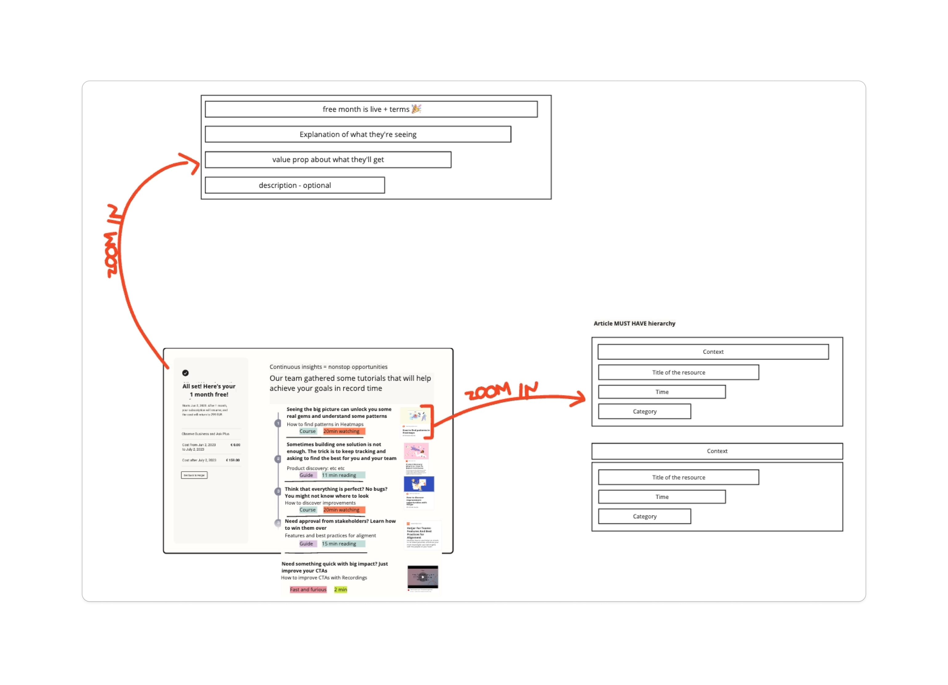
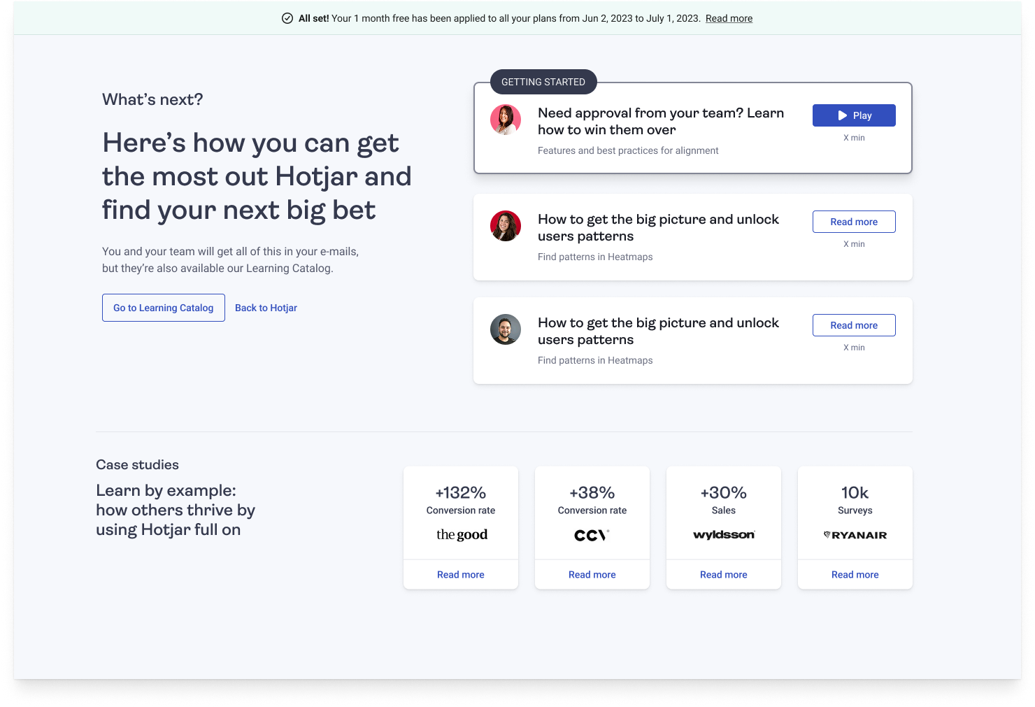
Why I built it this way
A generic "here's how to use Hotjar" email or screen treats a user who churned because of budget the same as one who churned because they rarely used it. The content strategy needed to meet each persona where they were, and give them a reason to come back that matched their original intent, with information that’s actually relevant for them.
Note: Phase 3 was fully designed and ready to ship but was deprioritized in the following quarter. I continue to advocate for its implementation — the infrastructure is built and the content is ready.
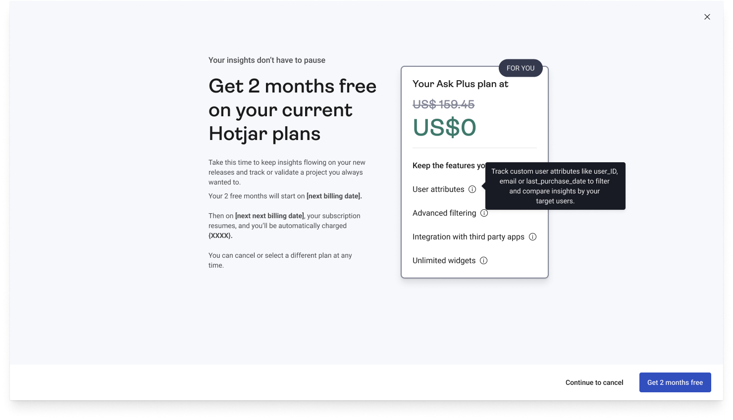
Phase 2
Phase 2 results — 2-month offer
21%
overall acceptance rate
52.98%
kept subscription for 1+ month
~$1M
ARR saved (estimated)
What moved, and what it means
52.98%
kept subscription after offer
21%
overall offer acceptance
28.53%
budget cohort acceptance
The move from a 1-month to a 2-month offer doubled acceptance rates, suggesting the content proposition of "enough time to actually see value" was the right framing, not just the offer length. The budget cohort outperformed the overall rate by 7.5 percentage points, validating the personalized content approach.
What I'd do differently, and what's next
What I'd do differently
Start with the offer (Phase 2) rather than the modal optimization. The null A/B result told us the real lever was the alternative we offered, not how we framed the loss. Earlier data would have pointed us there faster.
What the next experiment would be
Ship Phase 3 and measure whether users who engage with the educational content during the free period have higher 90-day retention than those who don't. That's the missing data point that would close the loop on the full strategy.